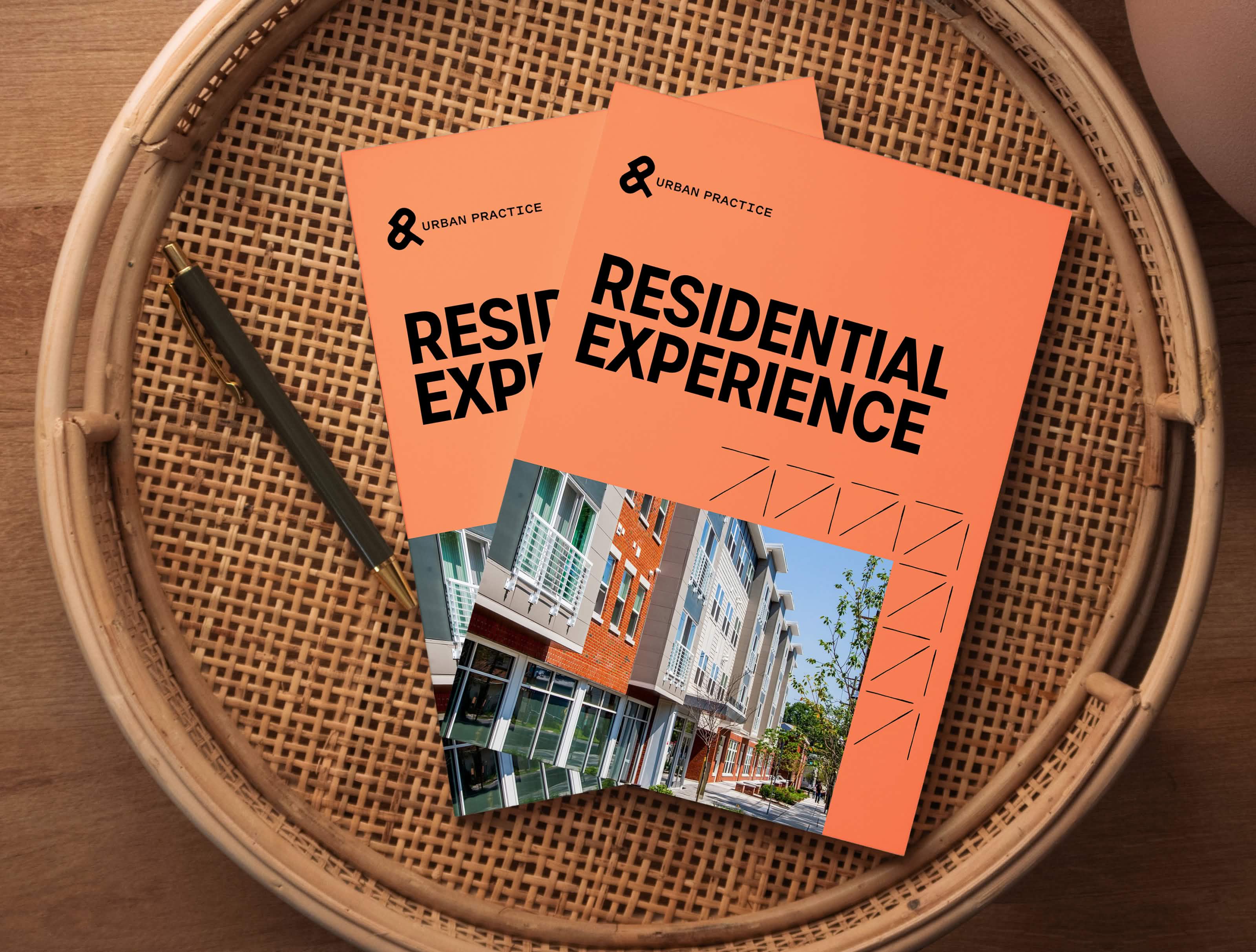
Based in Camden, New Jersey, Urban Practice is a design firm working across affordable, student, military, and market rate projects. While their current work spans architecture, interior design, and planning, their ambition reaches further. The Urban Practice team are community growth leaders. They partnered with Third & Arch to articulate this larger vision and position their brand as a strategic partner in neighborhood transformation.
The Ask.
Urban Practice has a big vision. While they excel at design and planning, their real ambition is to be known as community builders. They wanted a brand that would position them as the go-to partner for large-scale neighborhood revitalization—the team that cities and communities call first when they’re ready to transform spaces with everyone in mind.
The Answer.
We helped Urban Practice redefine their brand. By focusing their brand strategy on their ability to lead large-scale, community-focused projects, we gave them a clear, compelling voice that positions them as the ultimate partner for urban revitalization. Now, when a city wants to reimagine a neighborhood, Urban Practice is the first name that comes to mind.
The Goods.
- Discovery Workshops
- Brand Messaging
- Visual Identity Design
- Brand Style Guide
- Web Design
- Website Development
Brand Strategy
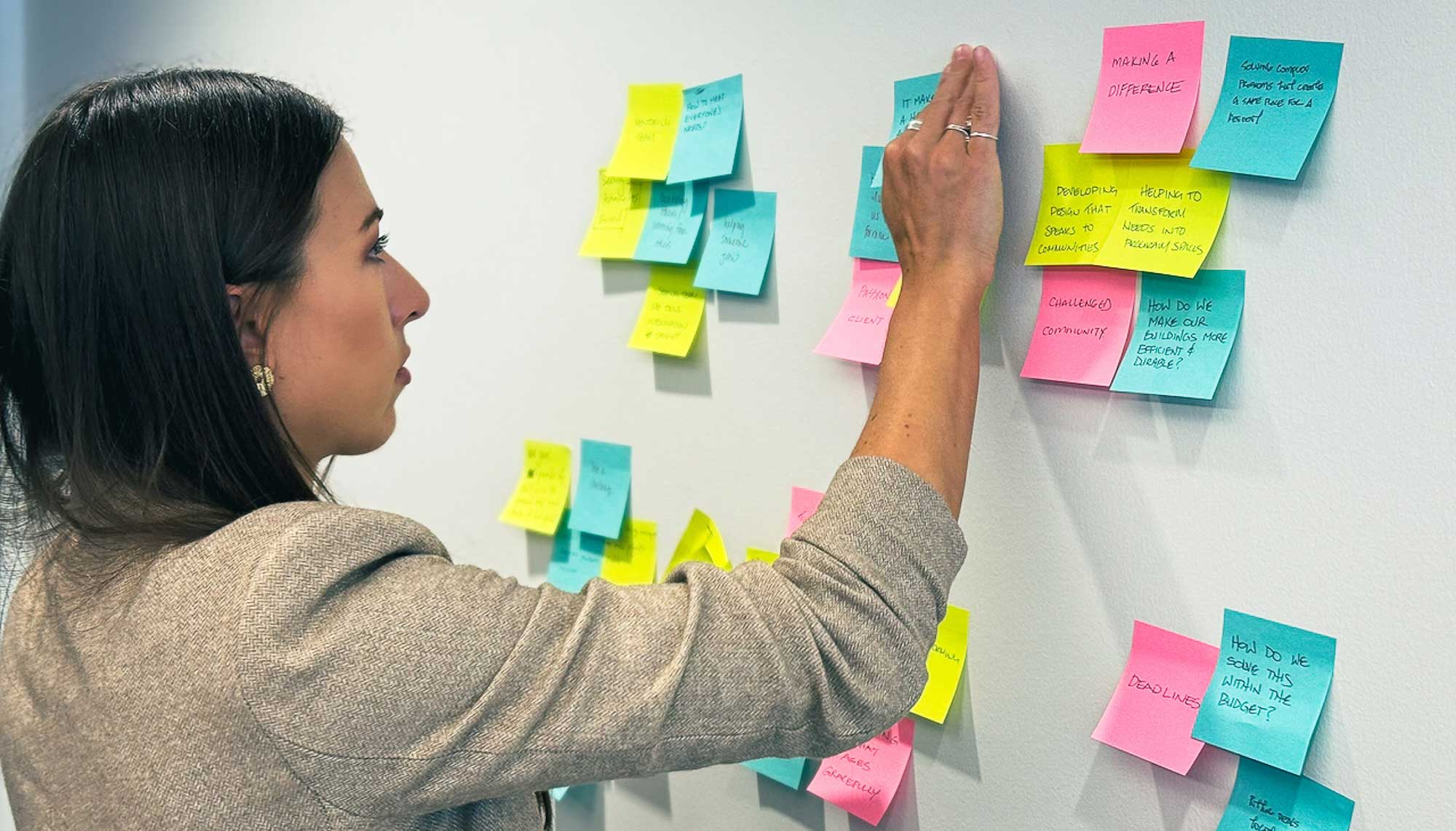
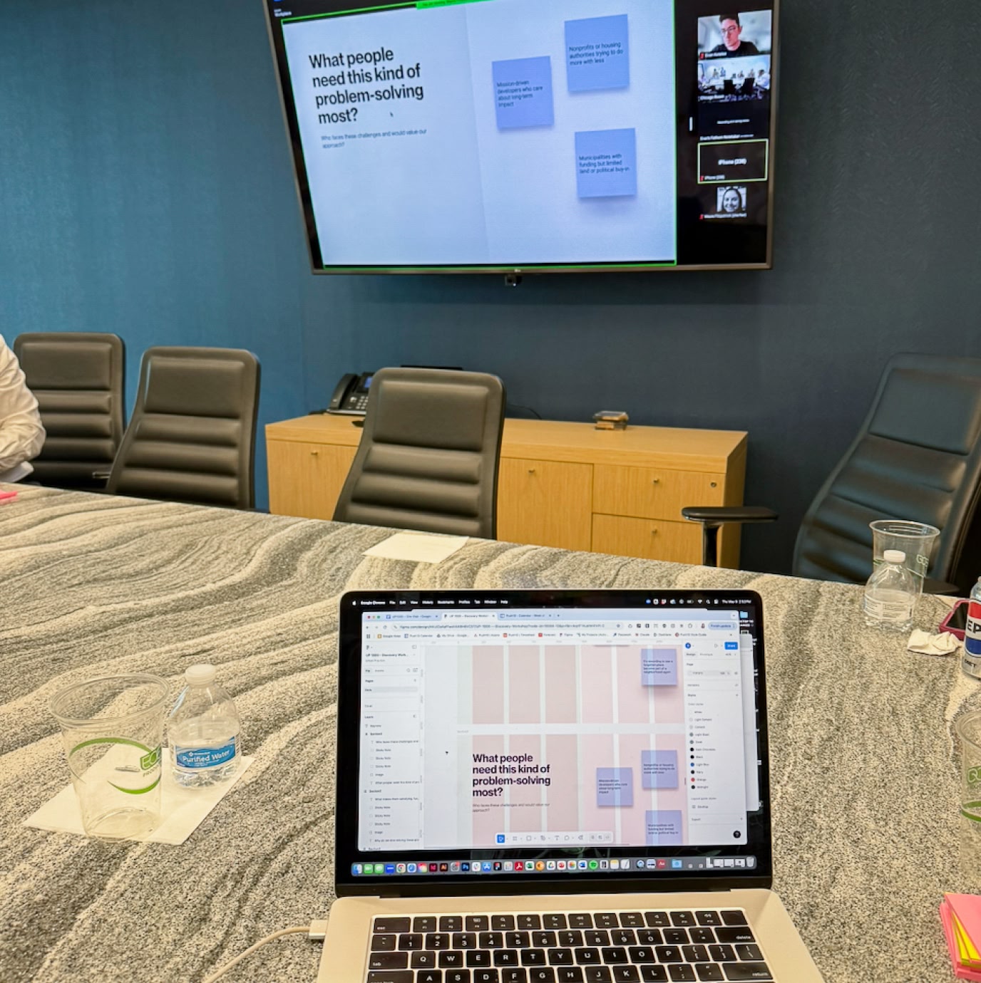
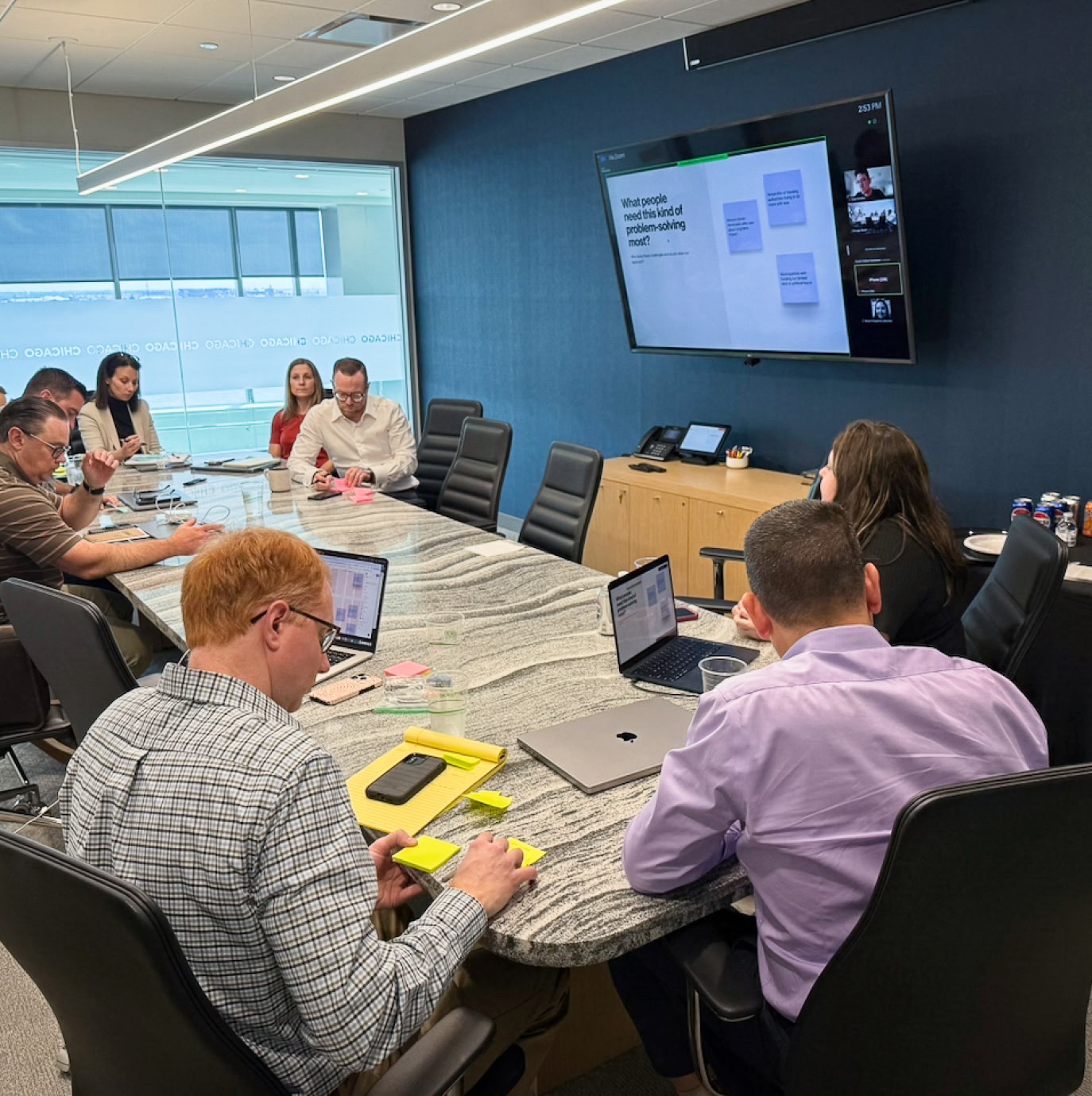
We started our work by visiting the Urban Practice headquarters in Camden, New Jersey. During a day of workshops, we set goals for our work, explored target audience needs, discussed the firm's vision, and explored new messaging territories.
Brand Platform, Messaging, and Tagline
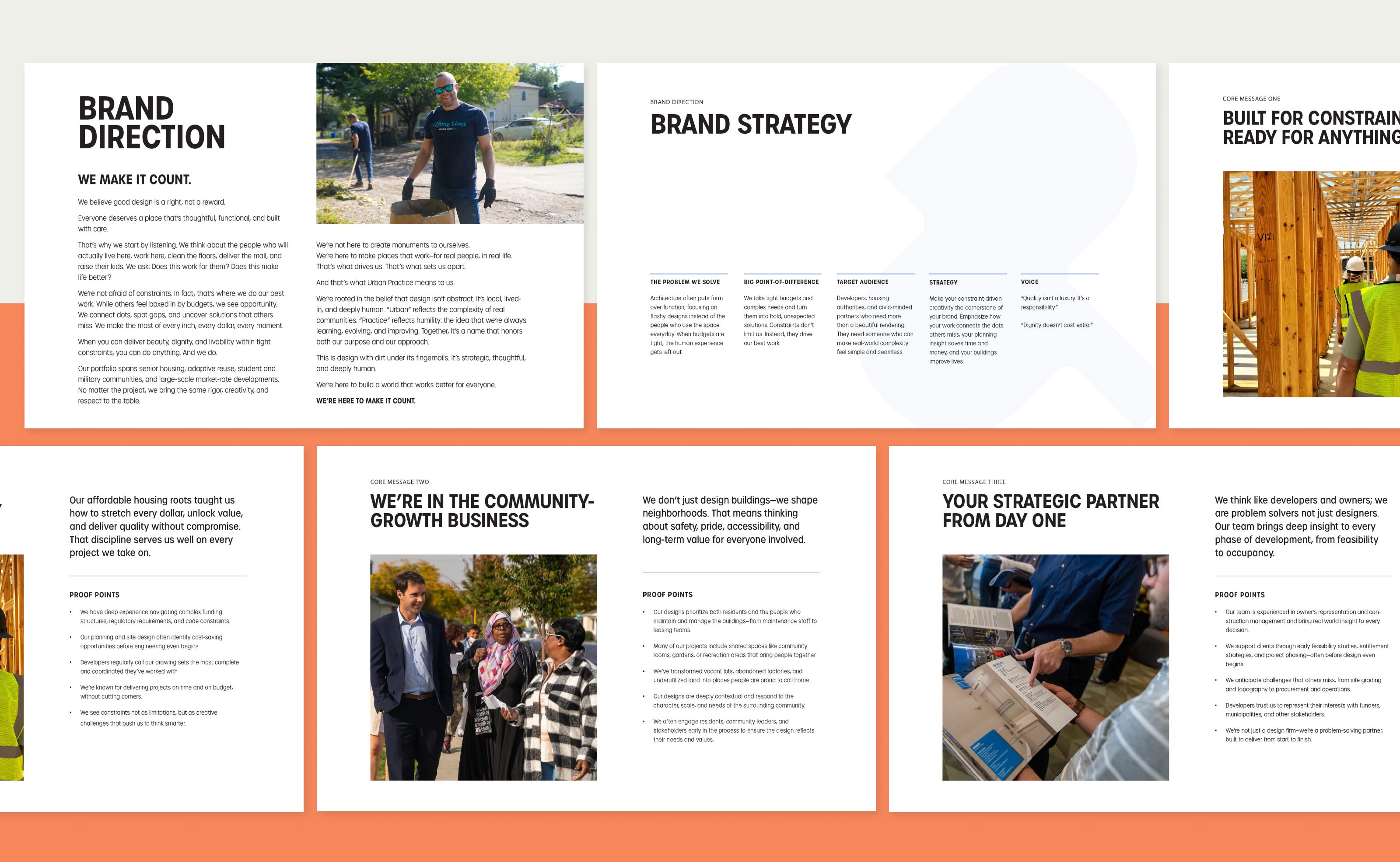
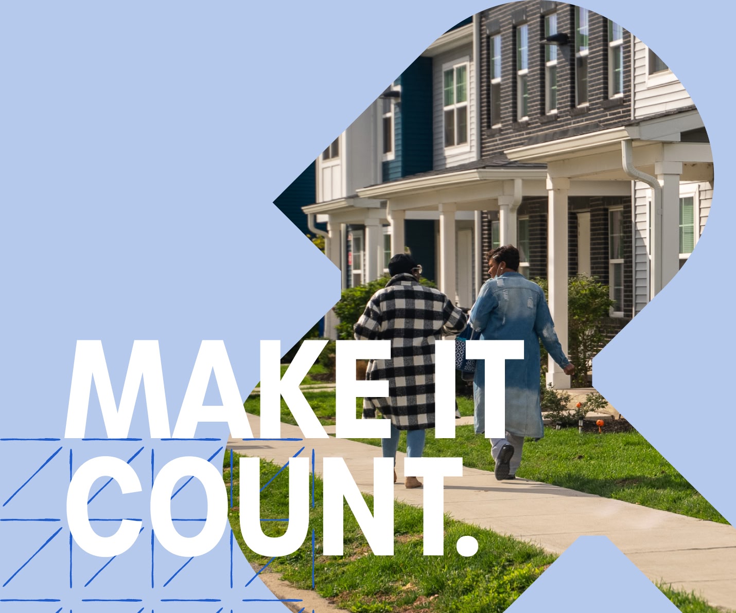
Urban Practice’s brand positioning and messaging positions the firm as a leader in community-centered design and development. It is grounded in the belief that good design is a responsibility, not a luxury. By making every dollar, every square foot, and every decision count, the strategy reframes constraints as opportunity and positions the firm as a trusted partner in shaping communities that work for real people.
Visual Identity
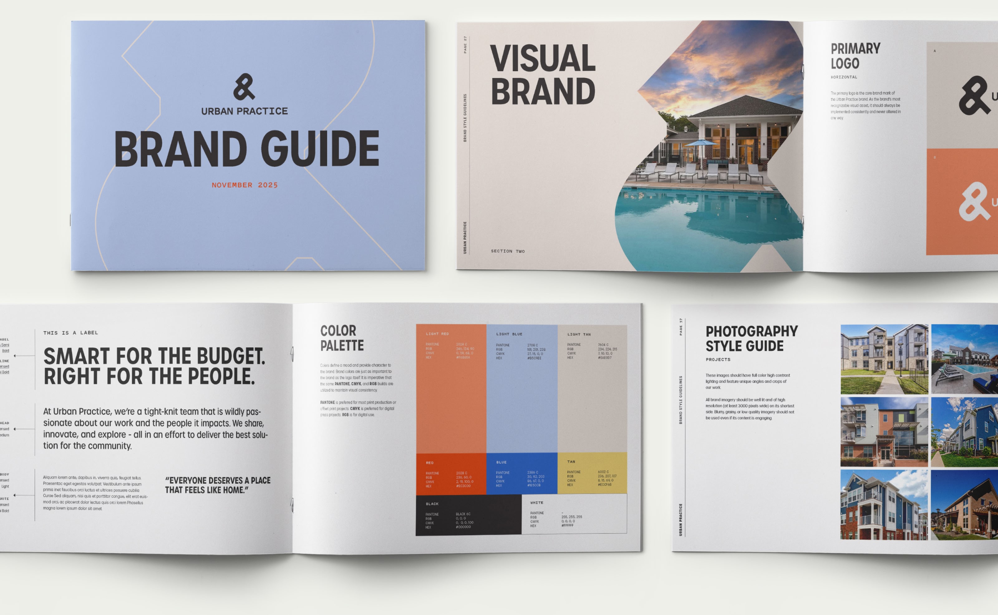
Next, we created a brand system that transforms Urban Practice's strategy into a memorable visual identity. Every element is designed to express connection, progress, and practicality. The system includes a logo that symbolizes bringing people and priorities together and typography, color, and illustrations that convey clarity, warmth, and accessibility.
A Logo Designed to Connect People and Priorities
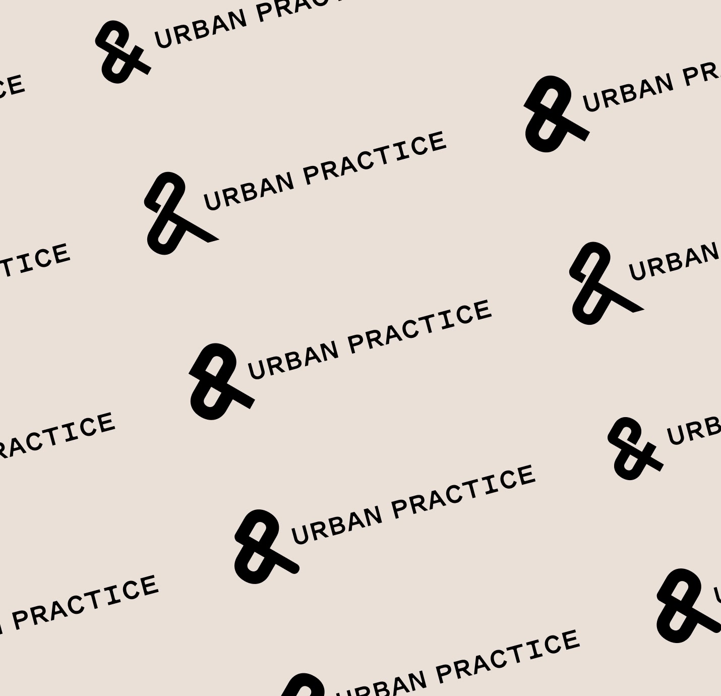
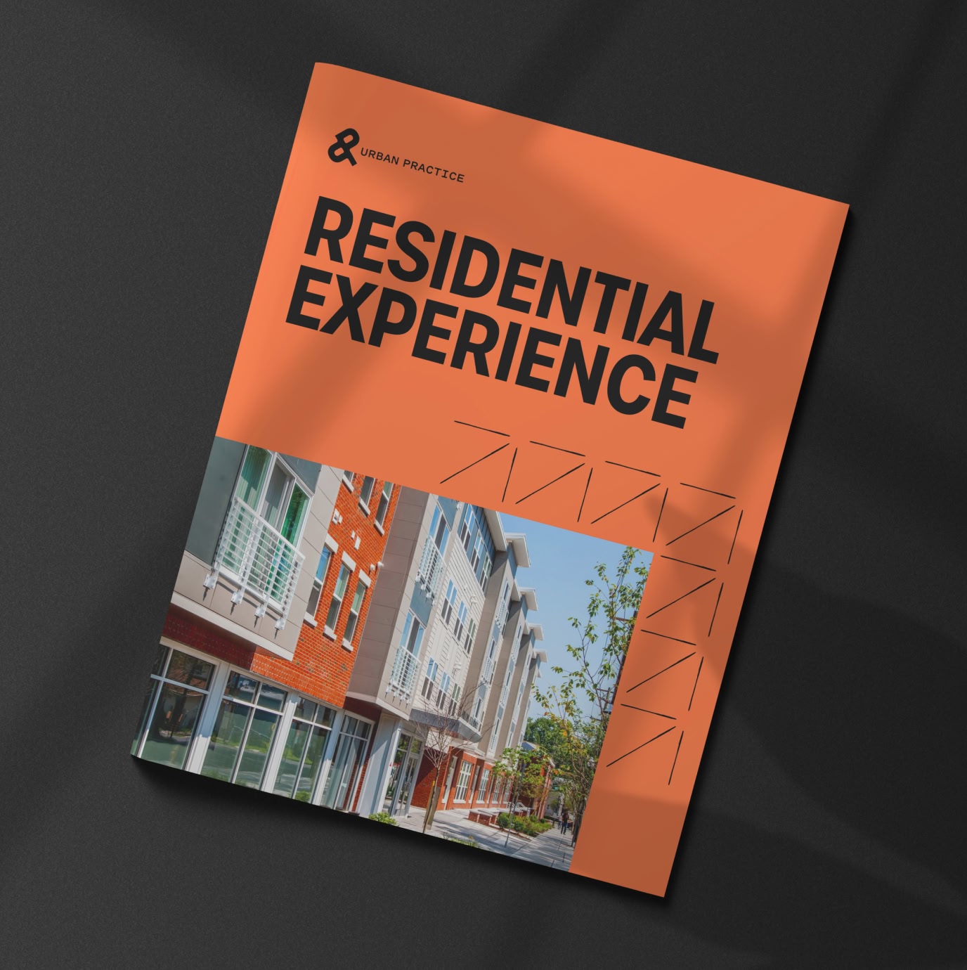
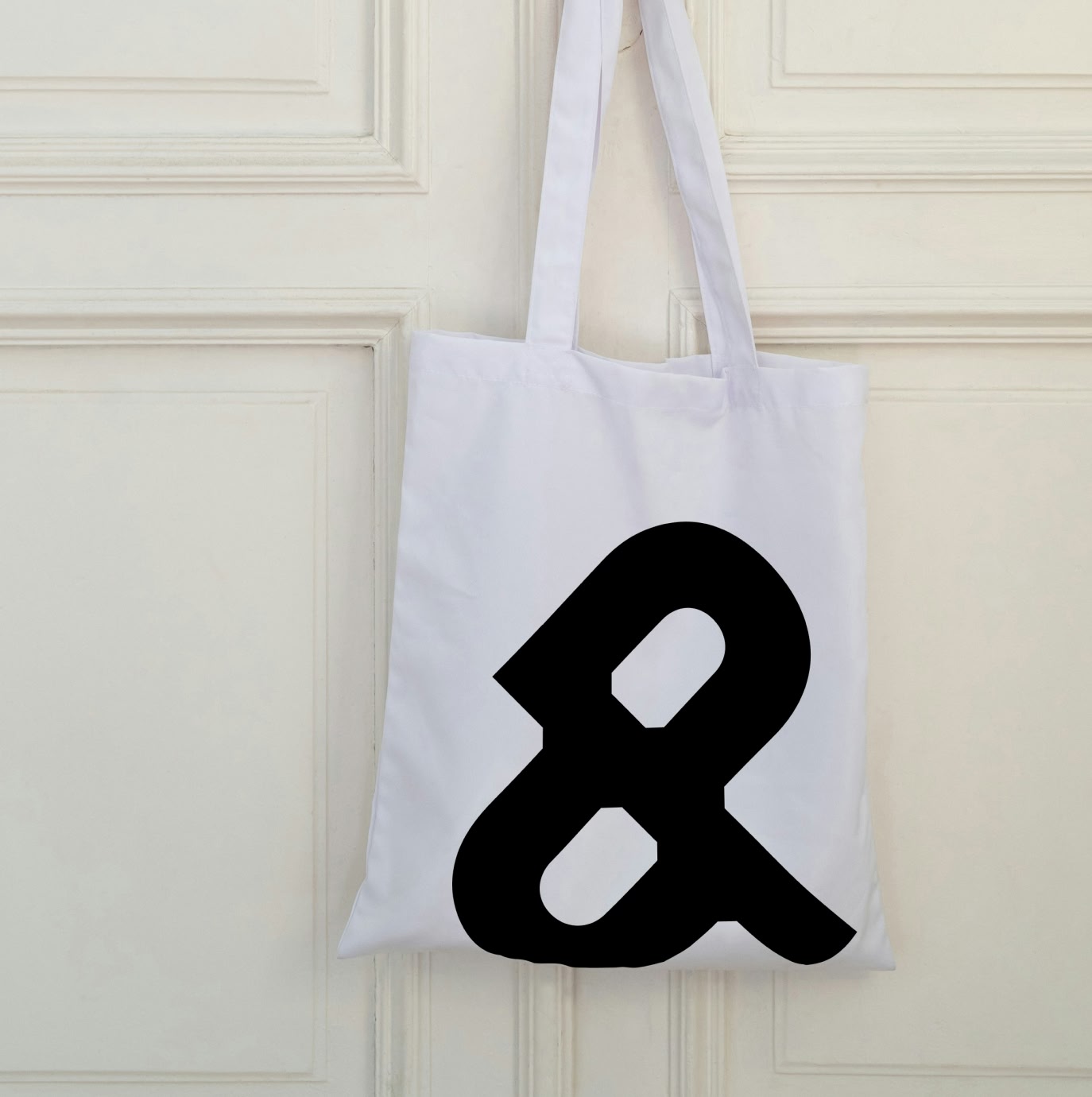
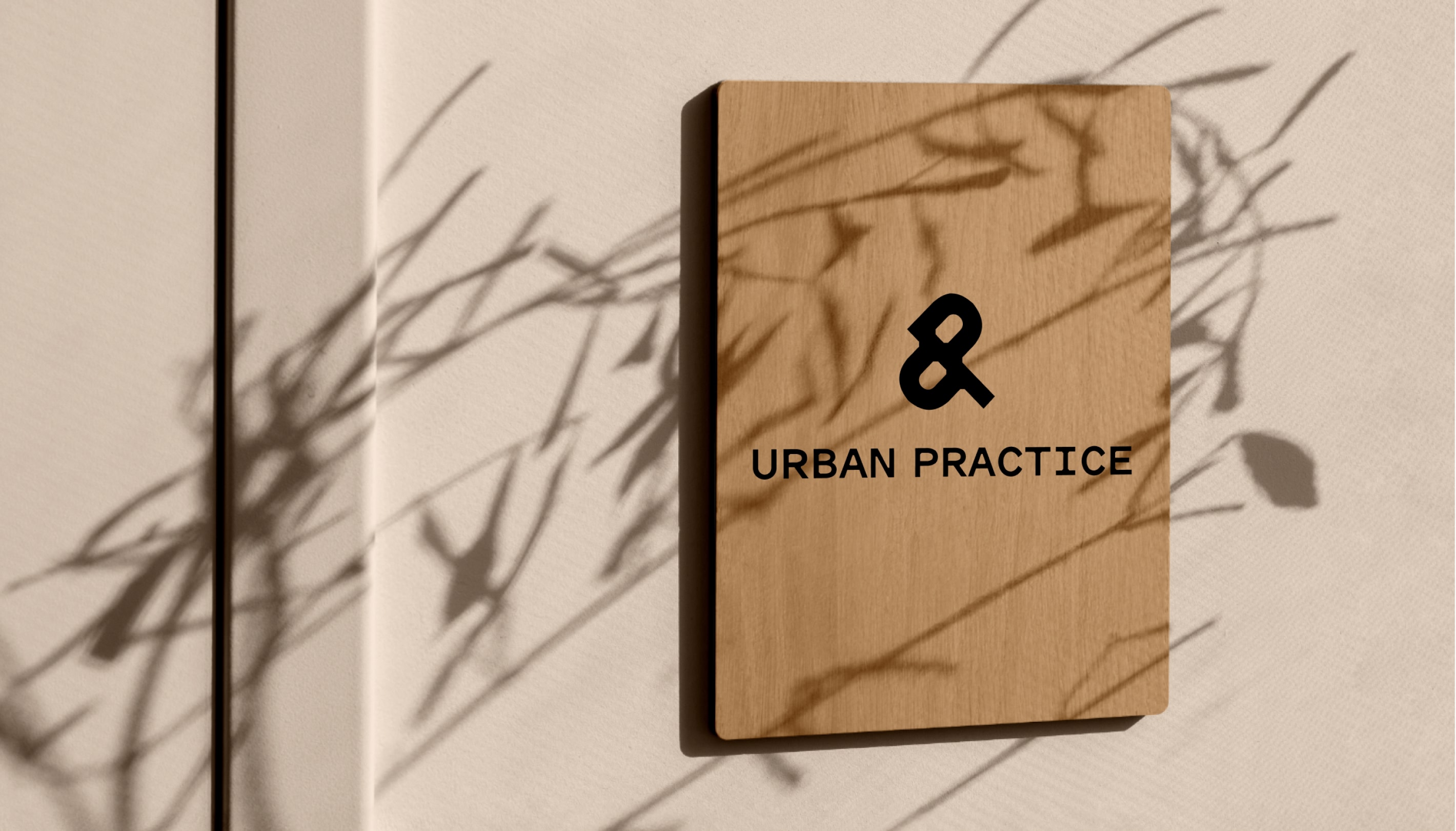
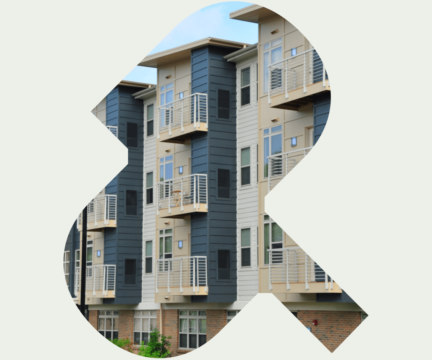
The new logo reimagines the U and P as an ampersand, symbolizing connection, partnership, and the firm’s role as a convener that brings people and priorities together. A modern monospaced typeface reinforces a sense of craft, clarity, and practicality, while a grounded color palette balances energy with trust and warmth. Supporting elements include upward motion graphics and hand-drawn illustrations that reinforce the idea of progress, accessibility, and design that works for everyone.
Digital Expansion
The brand was built to extend naturally into digital environments. With a refined hierarchy, expanded graphic toolkit, and more intentional use of motion and layout, the new system gave the brand the structure and flexibility needed to confidently move into the next phase of updating the website.
Web Design & Development
As we finalized the new brand, it was time to turn our attention to refreshing the Urban Practice website.
A New Beginning
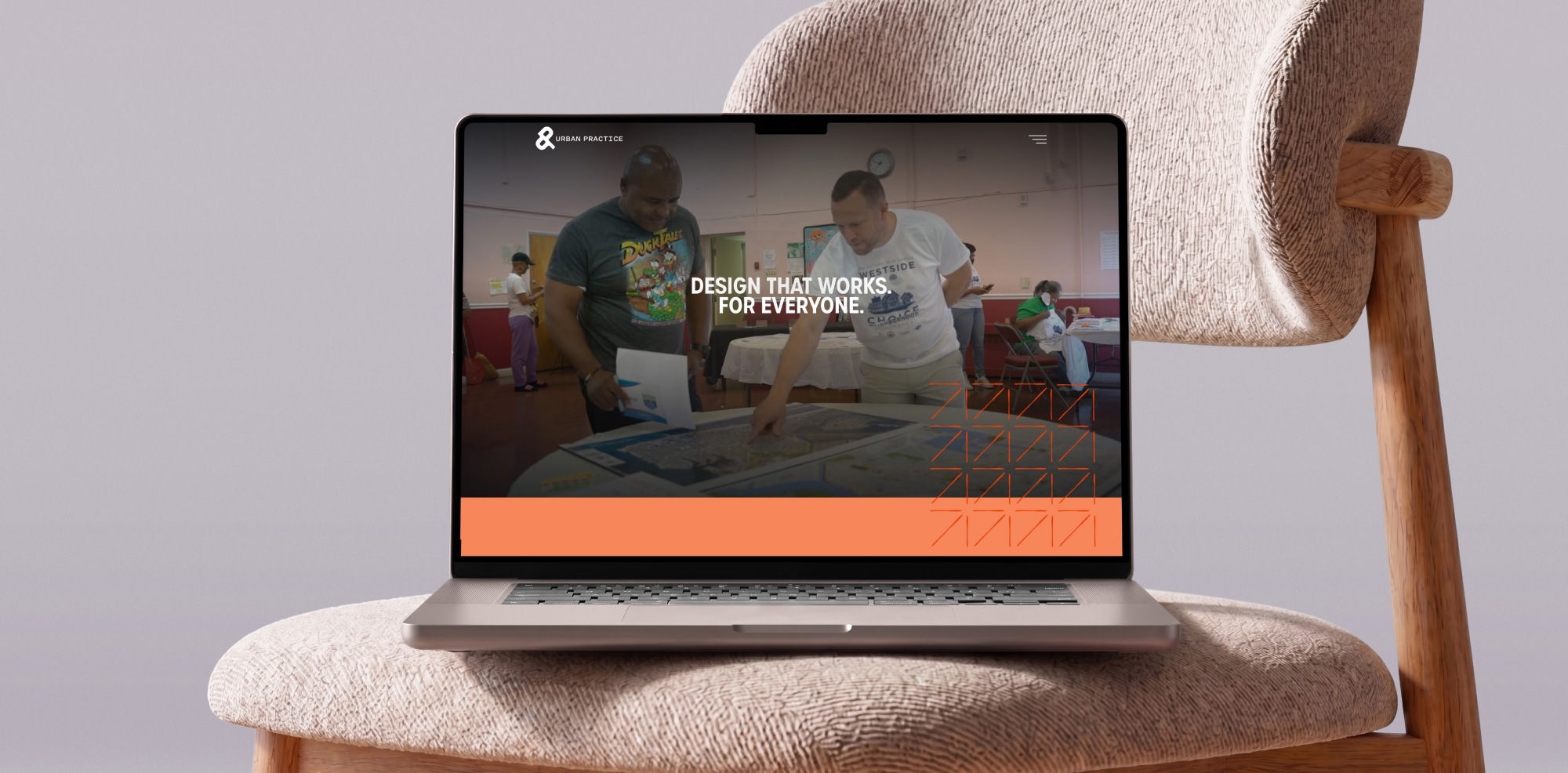
Urban Practice's existing website was relatively new and well-built, with a solid foundation. But with the launch of the new brand, the visual aesthetic and messaging no longer matched the firm's identity. The solution? Rather than a complete overhaul, we were able to provide our client with a reskinned user interface design, as well as updated messaging. And, we were able to deliver this solution at a fraction of the cost of a ground-up build. Win, win.
Comprehensive, yet Efficient.
In many cases, a simple website reskin project might be considered a half-baked solution. But not this time. We touched almost every element of the site, including type, colors and images. The result is a new web design that matches the visual aesthetic of the new brand, yet did not require a full-blown process, new content, or a time-consuming testing phase.
The Result.