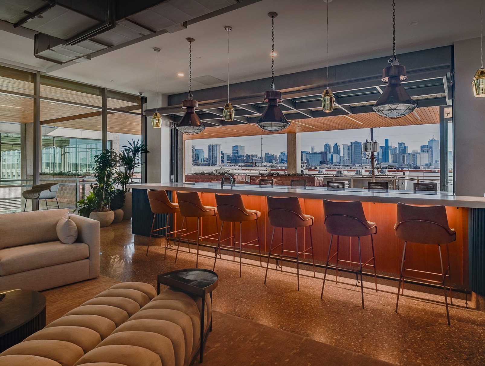
Muckleroy & Falls is a Texas-based general contractor with over four decades of experience delivering complex commercial, industrial, and institutional projects. The respected construction firm has built a reputation on reliability, relationships, and results. We provided our client with a refreshed identity and website, further cementing their brand as one of the most trusted builders in the region.
The Ask.
Muckleroy & Falls is a Texas-based commercial general contractor with a decades-long track record of delivering complex commercial, industrial, and institutional projects. The quality of their work had always set them apart, and the firm engaged Third & Arch to build a brand as strong as their reputation.
The Answer.
We started with deep discovery, including stakeholder interviews, competitive research, and brand positioning workshops, to uncover what makes M&F different. From there, we developed a full brand identity built around their culture of grit, precision, and partnership. Then, we designed a new website to bring it all together.
The Goods.
- Brand Strategy
- Brand Identity
- Logo Design
- Website Strategy
- Website Design
- Website Development
Discovery & Strategy
During our initial phase, we audited existing materials and conducted workshops to better understand our client's legacy, as well as their vision for the future.
The New Focus
Muckleroy & Falls had the proven track record. What they were missing was the language to talk about it. Through stakeholder workshops, competitive research, and audience interviews, we identified a clear pattern: M&F's strongest differentiator wasn't any single service offering. It was how the firm shows up. Humble. Relentless. Ready. As a branding agency built for construction companies, our role was to surface that truth and build a strategic foundation around it. The brand direction we developed positions M&F not as the loudest builder in Texas, but as the one clients come back to.

Brand Story
Effective marketing for a general contractor starts with knowing what actually separates them from the field. For M&F, that answer lived in their culture, their people, and the way they take ownership from day one. We built the brand messaging platform around three core pillars: Aligned from the Start, Solving Forward, and Grounded in People. Each one is grounded in how M&F actually works. The brand promise, "We push your vision forward," runs from pre-construction through closeout. The full deliverable included a brand style guide, voice guidelines, elevator pitches, and audience-specific messaging playbooks, giving the entire M&F team a consistent, confident way to tell their story in proposals, on the job site, and everywhere in between.
Brand Identity Design
A strong reputation deserved an equally strong brand identity to back it up.
The Final Logo
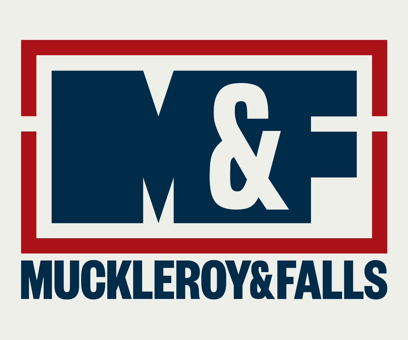
Given the long history of the firm, the M&F logo already had equity. Our job wasn't to replace it. It was to refine and future-proof it. We tightened the mark, reworked the bracket system, and developed a responsive logo suite that holds up at every scale, from hard hats to home pages to social media feeds. For construction companies investing in a rebrand, that kind of continuity matters. Clients and trade partners recognize the mark. The evolution respects that history while giving the brand the flexibility and polish it needs to compete for larger, more competitive projects.
A Refreshed Brand Identity
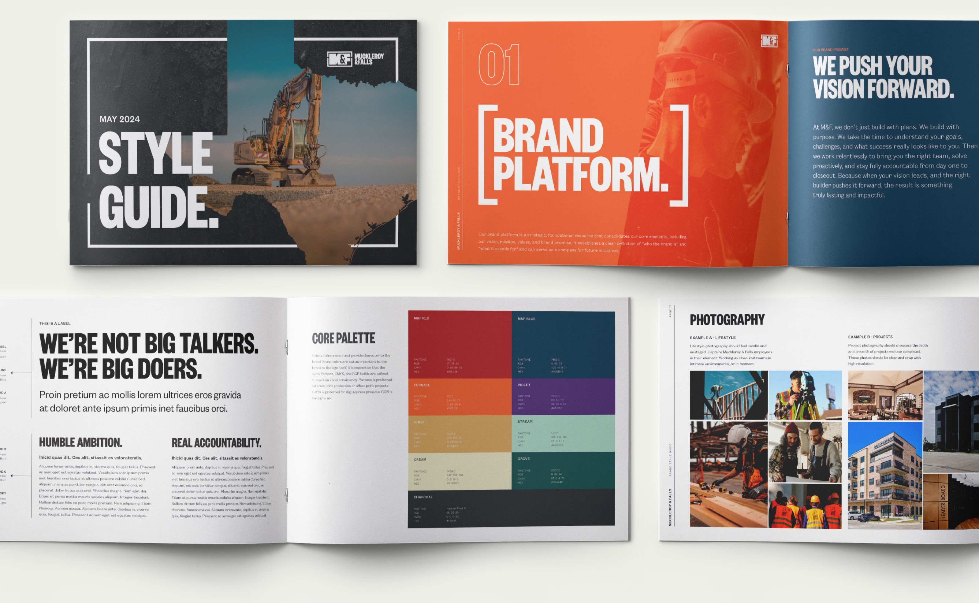
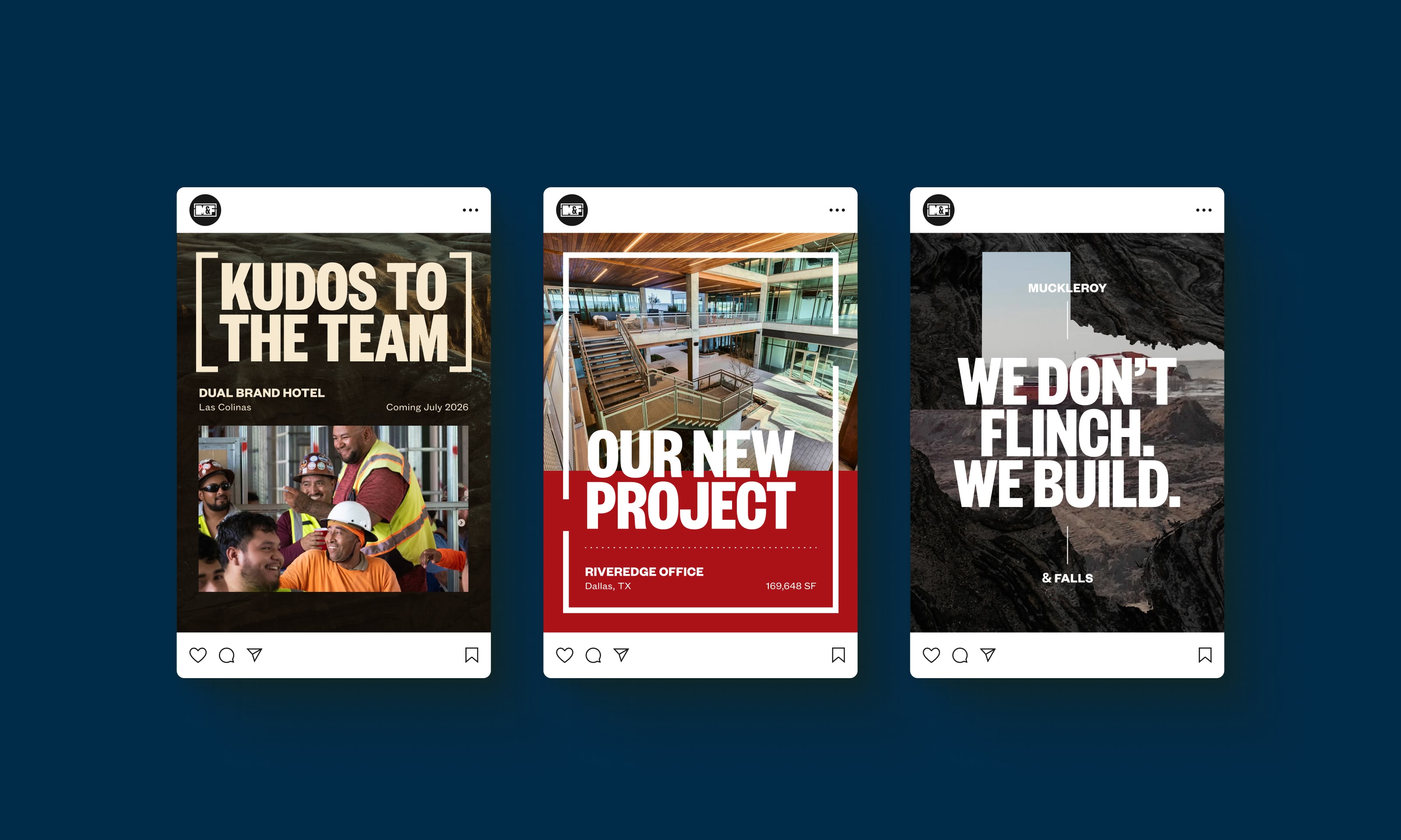
With strategy and identity in place, we extended the system across a full suite of branded collateral. A comprehensive brand book documents every element, from color palette and typography to voice guidelines and logo usage, so the M&F team can apply the brand consistently across proposals, social media, job site signage, and beyond.
Web Design & Development
A custom construction website designed to perform. And built to last.
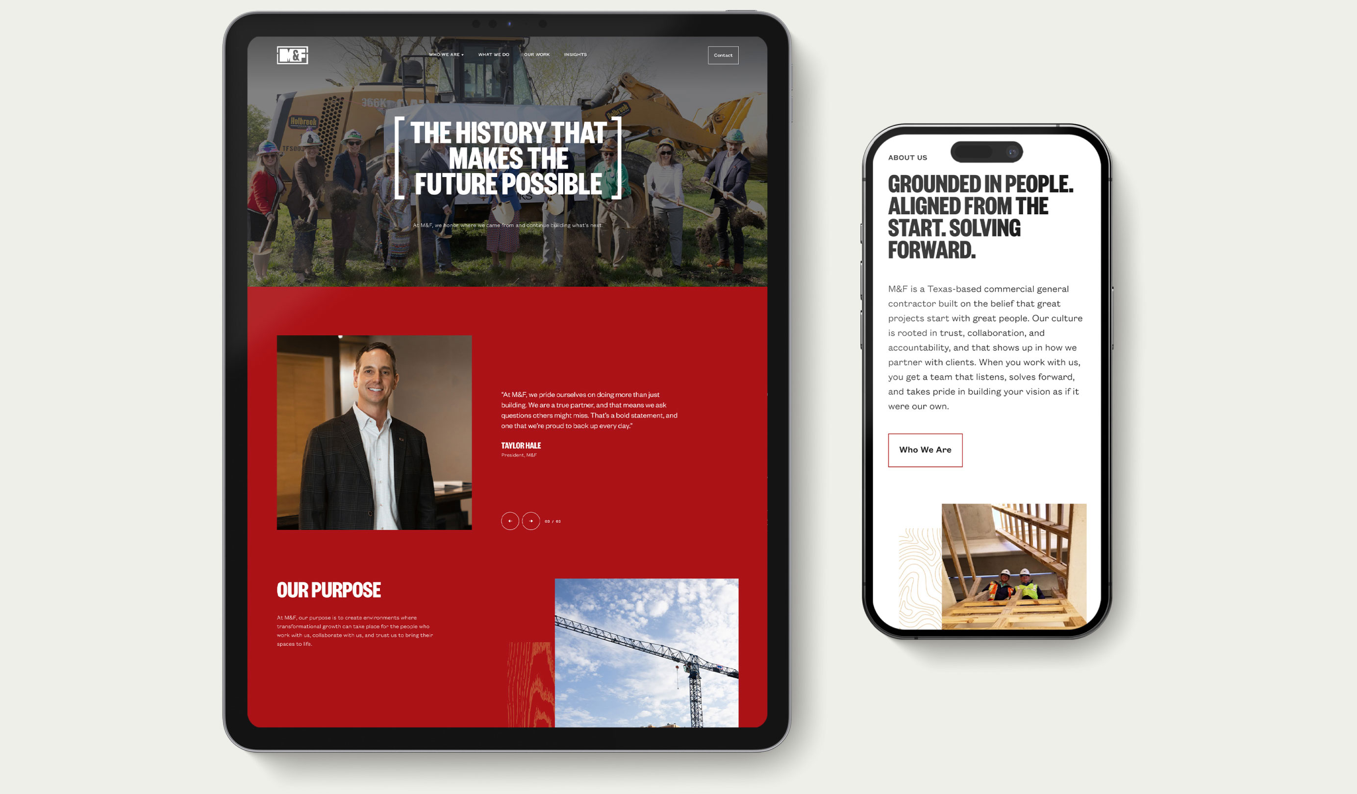
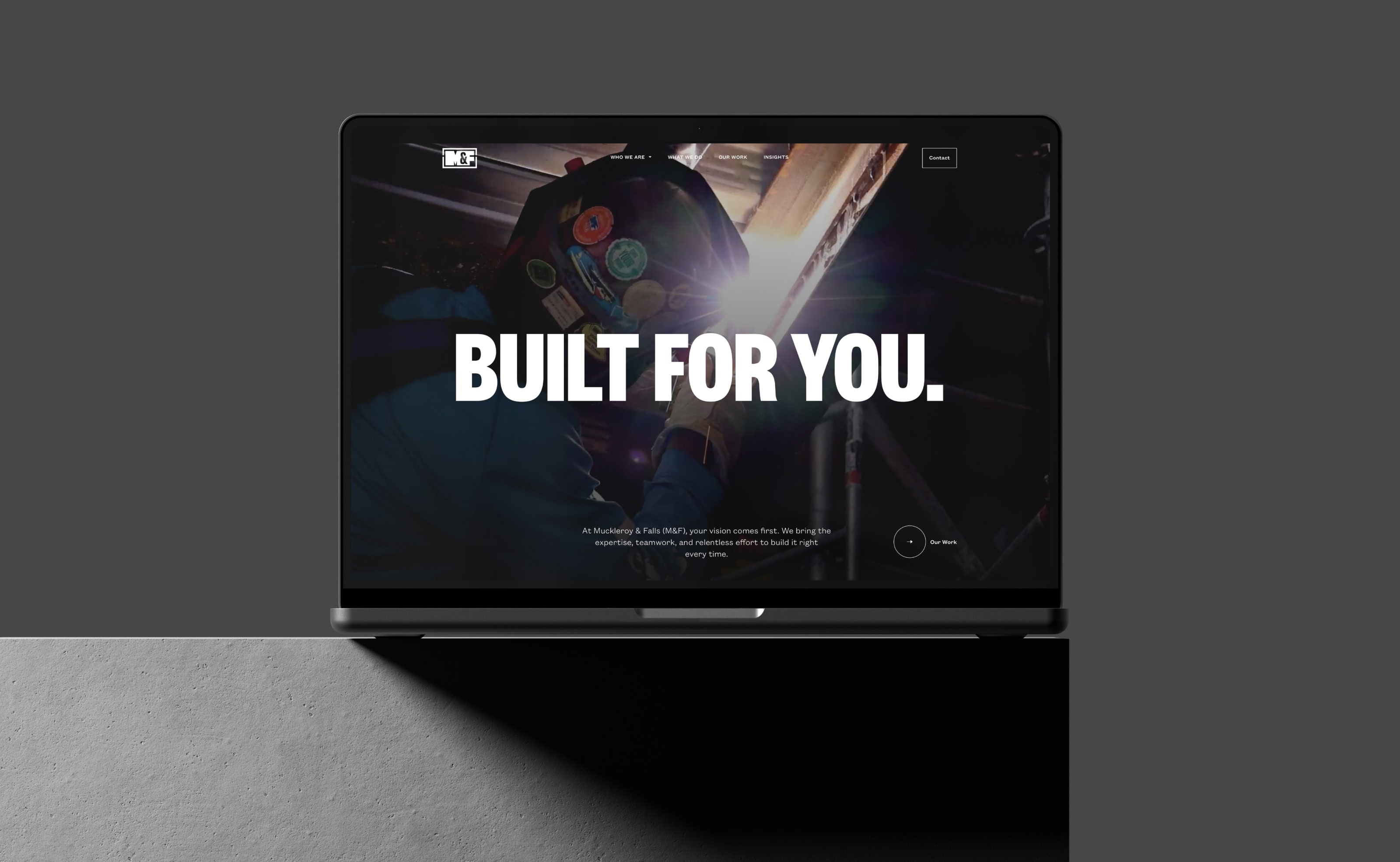
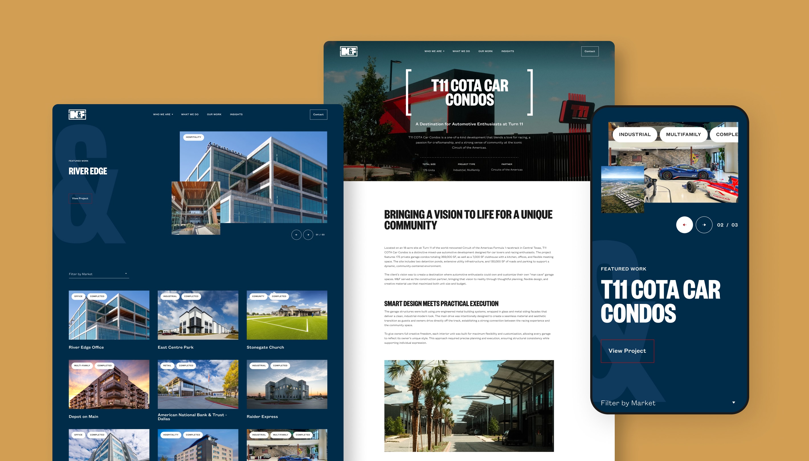
The M&F website was designed from the ground up to serve one purpose: earn the prospect's confidence before they ever pick up the phone. Every page, from the project archive to the team grid to the contact experience, was built around the way M&F's target audiences actually make decisions. Clean navigation, market-sector filtering, and a bold visual system ensure that whether a prospective client is a vision-driven developer or a seasoned owner's rep, they land on a website that feels like it was designed for them.
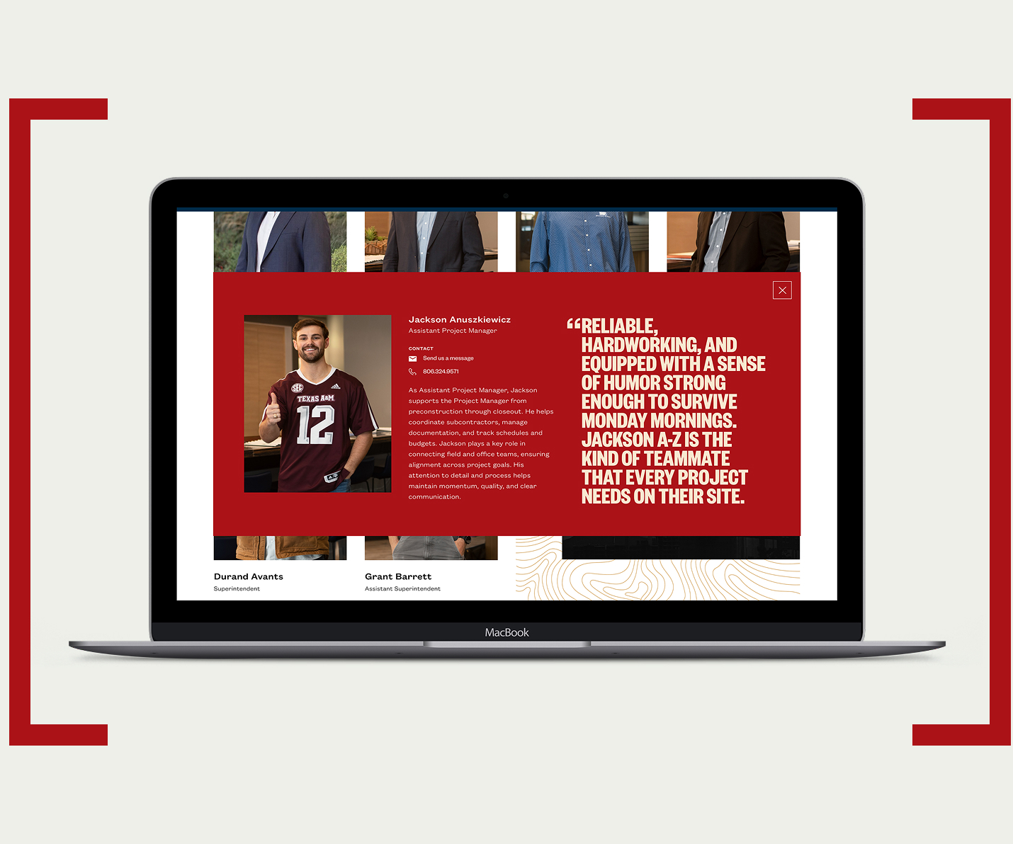
Team
The team page presented a specific challenge: M&F's people are their differentiator, but a standard headshot grid doesn't communicate that. We designed a filterable team experience with black-and-white photography that transitions to full color on hover, alternate personality shots on profile popups, and a layout that scales to a large roster without losing the human feel.
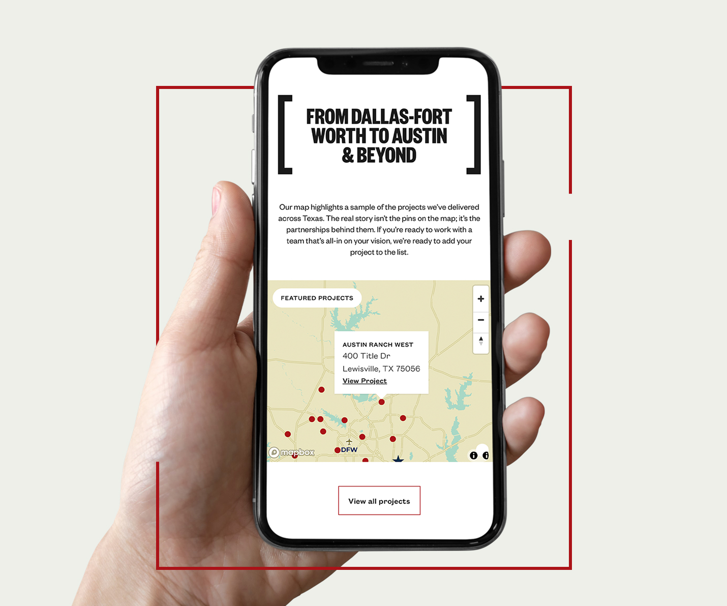
Map
M&F operates across Austin, Dallas, and Fort Worth, but a standard project map risks showing gaps in coverage rather than depth of experience. We worked through the display strategy carefully, developing a solution that showcases project density and market strength without exposing thin geography.
Many construction websites simply list services and show photos. The M&F site was built to do more. It positions the firm, communicates the brand promise, and gives every type of prospect, from commodity-driven developers to mission-led end-users, a clear reason to believe M&F is the right fit. That’s what separates a marketing tool from a digital brochure.
Built to Perform
A refreshed brand and website gave M&F a clear, confident way to show what sets them apart. The impact has been immediate. Since launch, the firm is on pace for the biggest revenue year in its 47-year history, and the team is walking into pursuits with a story that wins work.
The Result.